Show the Scratches: Why Your Creative Portfolio Needs Receipts in 2026
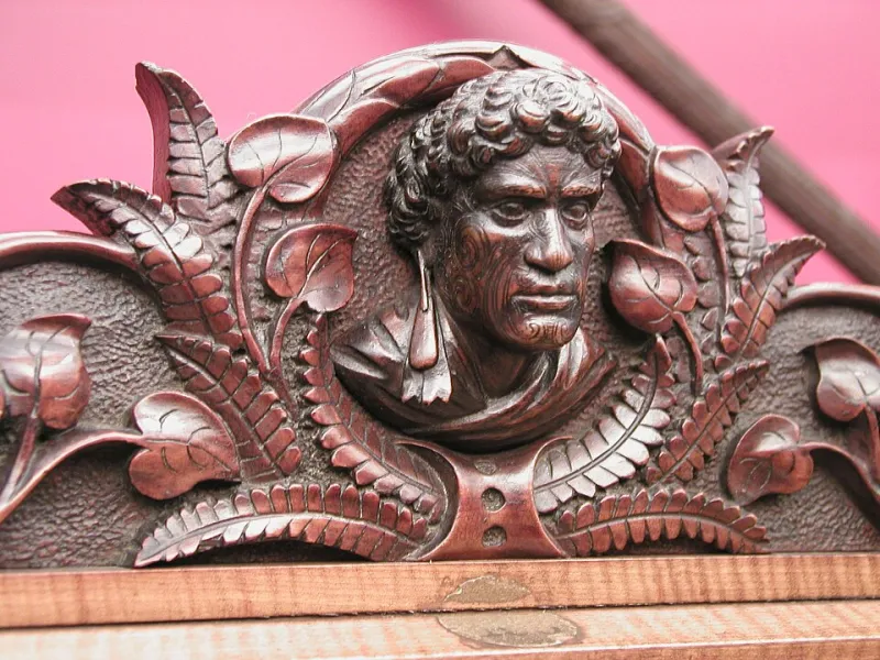
Photo: Anton Seuffert; Anton Teutenberg; Johann Levien, CC BY 4.0, via Wikimedia Commons
There is a version of the creative portfolio that still looks immaculate: six perfect projects, a tasteful serif, a grid that behaves itself, and an About page that says something about being ‘passionate’ without ever quite saying what you believe. It is not bad. It is just no longer enough on its own.
In 2026, the people hiring UK creatives are drowning in competent-looking work. They can find a hundred portfolios with clean layouts and clever mockups before lunch. What they cannot always find is evidence that you can think, decide, explain, adapt and behave like a person they would want in the room. That is where the scratches come in.
This is not an argument for flinging open your diary. It is an argument for publishing receipts: the visible trail behind the work. Andrew Bradley’s site tagline — work, opinions and projects — is a useful lens here. Work is the finished thing. Opinions are the reasons. Projects are the experiments. A portfolio that only shows the first one is basically a PDF with a pulse.
The polished showreel had a good run
For years, creative sites were built like shop windows. You put the best objects behind glass and hoped the right passer-by would press their nose against it. That made sense when the main problem was access: clients could not easily see what you made. Now they can see everything. The scarce thing is judgement.
A UK client in Manchester or Bristol or Leeds is often not asking, ‘Can this person make something nice?’ They are asking, ‘Will this person make the right calls when the brief changes, the budget wobbles, and the stakeholder with strong opinions arrives late to the meeting?’ A polished gallery cannot answer that. A short process note can.
What clients actually want to see now
They want to see how you frame a problem. They want to know what you discarded and why. They want a hint of your taste, not just your software skills. They want to know whether you can write a sentence that is clear enough to survive a Tuesday morning email chain.
That does not mean every project needs a 2,000-word autopsy. It means your site should carry some proof of thinking. Think of it as showing the kitchen, not just the plated dish. Not the whole kitchen. Nobody needs to see the bin. But a few clean surfaces, a couple of good knives and a note about why you changed the sauce at the last minute can be far more persuasive than another glossy photograph of pasta.
Three kinds of proof worth publishing
First, process notes. Keep them short and specific. A paragraph on the constraint, a paragraph on the decision, a paragraph on what you would do differently. You are not writing a memoir. You are leaving a trail.
Second, strong opinions. Not hot takes, not culture-war nonsense, just clear positions about your craft. ‘Most brand guidelines fail because they are written for approval, not use.’ ‘I would rather ship a plain website that loads quickly than a clever one that needs a manual.’ Opinions give clients something to push against. That is useful. It makes you feel real.
Third, small experiments. Little things you made because you were curious: a type test, a photography walk, a prototype for a local café, a newsletter format you tried and abandoned. These do not need to be client work. In fact, they are often better when they are not. They show appetite.
The overexposure trap
There is a line between proof and performance. You do not need to publish every anxious thought, every client disagreement, every late-night panic. That is not transparency; it is unpaid therapy with a URL.
A good rule for UK creatives: publish the decision, not the drama. ‘We changed the colour because the first version failed on mobile’ is useful. ‘The client was impossible and I was exhausted’ is not. Keep client confidentiality tight. Anonymise where needed. Ask before you share anything that could identify a project or a person. If in doubt, describe the pattern, not the specific job.
You also do not need to update daily. A site that feels like a live feed can become a full-time job. A site that feels like a well-kept notebook is more attractive. The goal is not to be constantly visible. The goal is to be legible.
A practical field guide for your own site
Start with one page called ‘Notes’ or ‘Thinking’ or ‘Receipts’. Give it a simple format: date, project or theme, what the problem was, what you decided, what you learned. That is it. Three short paragraphs can do more than a glossy case study with sixteen carousel images.
Next, add a line to each project page called ‘The decision I would defend in a meeting’. Force yourself to write one sentence. It will make the page better immediately. Then add a short ‘What I would change’ note. This is not weakness. It is evidence of judgement.
Finally, let your opinions live somewhere visible. A blog, a newsletter archive, a page of short statements. They do not have to be polished essays. They have to sound like you. If your site says work, opinions and projects, then actually show all three. Otherwise the tagline is just decoration.
Make it feel like a person, not a PDF
The portfolio is not dead. It is just being asked to do a different job. It has to prove not only that you can make things, but that you can think about them, talk about them, and make useful decisions when the work gets messy. In 2026, that is the difference between a site that looks employable and a site that feels trustworthy.
So show the scratches. Not all of them. Just enough to prove there is a mind behind the polish.