Andrew Bradley Work, opinions and projects from a UK creative.

Andrew Bradley

Work, opinions and projects from a UK creative.

Latest Articles

The Credits at the Back: Why Your Site Should Name Its Type, Tools and Trade-Offs
Practical Guide

The Credits at the Back: Why Your Site Should Name Its Type, Tools and Trade-Offs

A short page naming the typefaces, build tools, hosting and constraints behind your site is not a gear review or a diary. It is a quiet trust signal for UK creatives — and it takes about twenty minutes to write. Here is what to include, what to leave out, and a template you can steal.
A Small Museum of Your Misses: Why Retired Work Belongs on the Site
Practical Guide

A Small Museum of Your Misses: Why Retired Work Belongs on the Site

Most creatives quietly delete old projects once they stop feeling like the current version of themselves — which also deletes the proof that their taste has moved on. A short, dated archive page gives retired work a proper shelf: visible enough to show range, separate enough not to muddy the live portfolio.

Your Press Page Doesn't Need Fame: The Two-Bio Rule for UK Creatives
Practical Guide

Your Press Page Doesn't Need Fame: The Two-Bio Rule for UK Creatives

Podcasters, event organisers and local journalists keep asking for 'a bit about you and a photo'. A small, honest press page answers that request before it lands in your inbox. Here's the lean media kit I'd build for a personal-brand site in 2026.

A Note, Not a Policy: The Privacy Page You'd Actually Want to Read
Practical Guide

A Note, Not a Policy: The Privacy Page You'd Actually Want to Read

Most personal sites hide a generic privacy policy at the bottom and hope no one looks. A short, plain-English note about what you collect and why can be a quiet trust signal instead. Here's how to write one in your own voice — without pretending to be a solicitor.

The Portfolio Gap: Publishing Credible Work When the Contract Says Silence
Practical Guide

The Portfolio Gap: Publishing Credible Work When the Contract Says Silence

Most UK creatives have at least one project they can't name. Here's a practical way to turn confidential work into an anonymised case study that still says something useful — plus a short approval email that makes saying yes easy.

The Page That Answers the Question They're Too Polite to Ask
Practical Guide

The Page That Answers the Question They're Too Polite to Ask

Most creative sites explain what a client will get. Very few explain what it will feel like to work with you. A one-screen 'how I work' page closes that gap, sets expectations in plain English, and quietly filters out the enquiries that were never going to fit.

A Status Note Beats a Stream: The Case for a Dated Snapshot on Your Site
Opinion

A Status Note Beats a Stream: The Case for a Dated Snapshot on Your Site

Your website does not need a content calendar to feel alive. It needs one honest, dated note that says what you are doing, what you are open to, and what has your attention this month. Here is the case for a small status page — and why it beats another blog.

Sign Your Work: The Quiet Case for a Credits Page
Practical Guide

Sign Your Work: The Quiet Case for a Credits Page

A colophon used to live at the back of a book, quietly listing the typeface, the paper and the people who made it. On a creative website, that same small page can do something similar: show your working, credit your collaborators and build trust without a single trumpet blast. Here is how to make one that feels like you.

Practical Guide

The Useful Dead End: Why Your 404 Page Deserves Better Than a Shrug

Most portfolio sites treat the 404 as a bin job. But a lost visitor is often one click from leaving for good — and a small, well-written error page can turn that moment into a warm introduction. Here is a practical UK-friendly checklist for copy, accessibility, speed, and the one link no 404 should be without.

In the Post, Not the Inbox: A Small Mailer That Earns a Second Look
Practical Guide

In the Post, Not the Inbox: A Small Mailer That Earns a Second Look

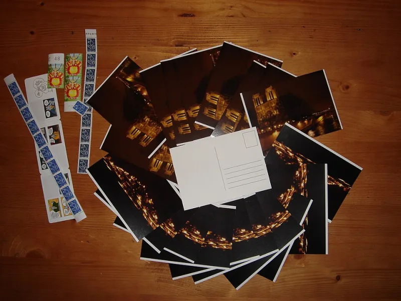
A digital portfolio is one tab among forty. A postcard is a small, physical interruption that costs less than a round of coffees and is far harder to ignore. Here is how to build a twenty-person mailing list, print something worth keeping, and post it without turning it into a project.

Just Say the Number: Why One Plain Rate Line Beats a Pricing Page Full of Waffle
Opinion

Just Say the Number: Why One Plain Rate Line Beats a Pricing Page Full of Waffle

Most UK creatives hide their rate behind tiers, caveats and a paragraph of apology — then wonder why enquiries arrive half-committed. Here's the case for one clear sentence, a short note on what's included, and a couple of scripts for the awkward bit afterwards.

Twelve Chairs and a Borrowed Table: The Case for a Tiny In-Person Portfolio Show
Practical Guide

Twelve Chairs and a Borrowed Table: The Case for a Tiny In-Person Portfolio Show

Another portfolio refresh can wait. A ninety-minute showcase in a local café — twelve guests, four pieces of work, and a clear reason to gather — can do more for your creative practice than another round of tweaking your homepage. Here's how to plan one without turning it into a second job.

The Polite Decline: Why a Short 'Not for Me' List Beats a Long Services Page
Opinion

The Polite Decline: Why a Short 'Not for Me' List Beats a Long Services Page

Most creative websites read like a takeaway menu: a long list of things you can order. But a menu that only says yes isn't really a menu — and the most useful paragraph on your site might be the one that quietly rules a few things out. Here's how to write refusals that feel confident rather than curt.

Ask Just Enough: The Contact Page That Does Half Your Discovery Call
Practical Guide

Ask Just Enough: The Contact Page That Does Half Your Discovery Call

A contact form is not a border check. It is the cheapest discovery call you will ever run. Here is how to ask six useful questions, phrase them like a human, and drop the three fields that make good clients hesitate.

The Quiet Brag: Putting Your Best Work Forward Without Apologising for It
Opinion

The Quiet Brag: Putting Your Best Work Forward Without Apologising for It

British self-deprecation is charming until it starts costing you work. A personal site in 2026 needs to state what you do, who it is for and why it matters - without sounding like a LinkedIn motivational poster.

A Sense of Place Without the Props: The Local Landmark Test for Creative Sites
Practical Guide

A Sense of Place Without the Props: The Local Landmark Test for Creative Sites

You do not need a Union Jack or a red phone box to sound rooted in the UK. This practical guide offers a simple test for deciding which local details give your creative site character - and which ones quietly shrink your audience.

Thirty Seconds to Trust: A Homepage That Introduces You Properly
Practical Guide

Thirty Seconds to Trust: A Homepage That Introduces You Properly

Your homepage is not a filing cabinet. It is the first 30 seconds of a conversation. Here is a practical UK creative's guide to passing the stranger test, with before-and-after copy and a simple structure that works for freelancers, studio leads and part-time makers.

Considered Rants Beat Hot Takes: Making Room for Opinion on Your Own Site
Opinion

Considered Rants Beat Hot Takes: Making Room for Opinion on Your Own Site

Hot takes are built for feeds; considered rants are built for trust. Here is why UK creatives should use their personal site for measured industry criticism, and a repeatable format for doing it without becoming a LinkedIn argument factory.

Empty Portfolio? Build These Three Things This Weekend
Practical Guide

Empty Portfolio? Build These Three Things This Weekend

If your portfolio feels empty, the problem is usually definition rather than talent. Here is a weekend's worth of substitute artefacts — a brand teardown, a redraft, a point-of-view note — and how to frame each so a UK client reads judgement, not filler.

Sorry to Bother You: Six British Website Habits That Undermine Good Creative Work
Opinion

Sorry to Bother You: Six British Website Habits That Undermine Good Creative Work

We apologise for existing, bury the price, and lead with a CV. These are national traits, not personal failings — but they make UK creative sites harder to hire from. Here are six habits, and six ten-minute fixes.